Legacy Vertical Navbar
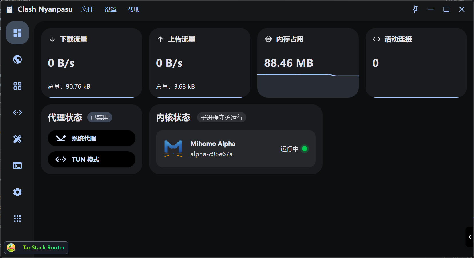
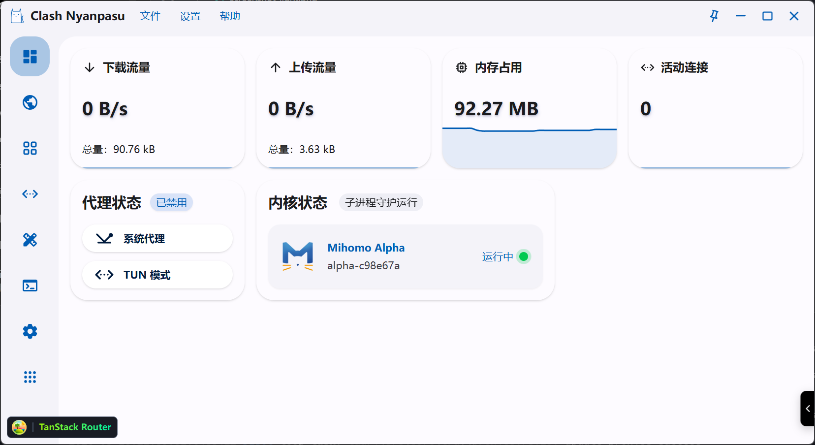
Transforms the default horizontal top navbar into a left-side vertical layout, similar to traditional app sidebar styling.
Effects
- Navbar changes from horizontal to vertical orientation
- Buttons enlarged to squares, ideal for icon display
- Button labels hidden, showing only icons
- Content area gets rounded card styling
- Both dark and light themes supported
Use Cases
For users who prefer a compact sidebar navigation, freeing up vertical space at the top.
CSS
style.css
app-header {  background-color: color-mix(    in oklab,    var(--color-surface-variant) 30%,    transparent  );}
.dark app-header {  background-color: color-mix(    in oklab,    var(--color-surface-variant) 15%,    transparent  );}
app-content-container {  padding-top: 8px;  flex-direction: row;  align-items: stretch;  background-color: color-mix(    in oklab,    var(--color-surface-variant) 30%,    transparent  );}
.dark app-content-container {  background-color: color-mix(    in oklab,    var(--color-surface-variant) 15%,    transparent  );}
app-content {  width: calc(100% - 16px);  border-top-left-radius: 24px;  background-color: var(--color-mixed-background);}
app-navbar {  height: auto;  background-color: transparent;}
animated-tabs-container {  height: 100%;  flex-direction: column;  flex-shrink: 0;  gap: 8px;}
animated-tabs-item {  border-radius: 24px !important;}
animated-tabs-item:hover {  background-color: color-mix(    in oklab,    var(--color-surface-variant) 15%,    transparent  );}
navbar-label {  display: none;}
animated-tabs-item {  width: 64px;  height: 64px !important;}
animated-tabs-indicator {  border-radius: 24px !important;}
animated-tabs-item-label,animated-tabs-item-label svg {  width: 24px;  height: 24px;}